MMP 350 Class Work Week 1 – CSS Review
Table of Contents
- Exercise 1: Inheritance and Styling Conflicts in CSS
- Exercise 2: Four Ways of Selecting Elements
- Exercise 3: Positioning
- Exercise 4: Margins and Padding
- Download this Document in .docx Format
- Return to Class Plan
Note on Text Conventions
I display html elements in the text as follows: <div> <span> etc. Note that when talking in the plural I will write something like, the three <divs> have all turned green. HTML elements are never plural. I use this convention because <div>s looks ugly.
Instructions
Over the next 45 minutes please work through the following exercises. Within the exercises are 12 questions followed by the phrase Your Answer. Please fill in your best guess as to what you think the correct answer is. If you cannot figure out an answer to a question please use an internet resource like W3CSchools to figure it out. Feel free to discuss answers with other students or with the instructor.
Exercise 1: Inheritance and Styling Conflicts in CSS
Purpose
- To demonstrate how cascading style sheets handle conflicts between elements, classes and element ids.
- To introduce students to some useful selection tips
Concepts
- Inheritance / cascading styles
- Serif and sans serif fonts. Sans-serif fonts are characterized by even line weights. They are typically used for headlines. Examples are Helvetica and Arial. Serif fonts have uneven stroke widths, characterized by serifs (nodes) at the end of strokes. They are typically used for body text because the serifs make the characters easier to read. Common examples are Times Roman and Booker.
Steps
- Create a folder called Exercise 1
- Open a browser in Private Browsing / Incognito mode. This is done to avoid caching issues by the browser.
- Create a file called exercise_cascading_stylesheets.html with the following attributes or use a copy provided by the Professor.
<!DOCTYPE html>
<html>
<head>
<meta charset="utf-8">
<title>Simple Cascading Example</title>
<link href="style_cascading.css" rel="stylesheet">
</head>
<body>
<div id="main">
<header class="header">Header</header>
<section>
<p class="body-text">Paragraph One</p>
<p class="">Paragraph Two</p>
<p class="">Paragraph Three</p>
<p id="last-paragraph" class=“”>Paragraph Four</p>
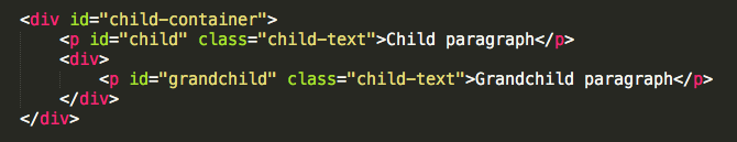
<div id="child-container" class="child-text">
<p class="">Child paragraph</p>
<div>
<p id="grandchild">Grandchild paragraph</p>
</div>
</div>
</div>
</section>
<footer>Footer</footer>
</div>
</body>
</html>4. Create a file called style_cascading.css with the following content:
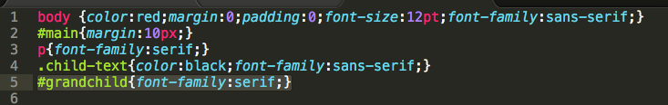
html{margin:10px;}
body {color:red;margin:0;padding:0;font-size:32pt;font-family:sans-serif;}
.child-text{color:black;}
Your document should display as follows:
Q1: Why is some text black and some text red?
5. Add the following to your style sheet.
p{font-family:serif;}Notice that all of the p elements are now in a serif font.
6. Make the font family for .child-text sans-serif
.child-text{color:black;font-family:sans-serif;}
Q2: Why did the child and grandchild paragraphs not become sans-serif?
7. Now add the child-text class to the Child paragraph and the Grandchild paragraph and refresh your page.
Q3: Why did the child and grandchild paragraphs become sans-serif?
8. Now add the following to the bottom of your css file:
#grandchild{font-family:serif;}The file should look like the following:
There are now two conflicting styles applied to the grandchild element, one applied via the classname .child-text, the other applied via the style for element id #grandchild
Q4: Why did the grandchild element become serif?
9. Now add a second class called quote to the #grandchild element in the html document. The result should look like the following. The word quote is in red for emphasis. In your html document it will not change color.
<div>
  <p id="grandchild" class="child-text quote">Grandchild</p>
</div>
… and add a class definition for quote to the style sheet:
.quote{margin:20px} Note how two different classes can be applied to the same element. But what happens when there is a conflict?
10. Modify the .quote class as follows:
.quote{margin:20px;font-style:italic;color:purple;}There is now a clash between the two classes. The .child-text class specifies a color of red and the .quote class specifies a color of purple. Which one wins? That depends on the position of the two classes in the file.
11. Change the position of the two classes in your css file, first with .child-text before .quote
.child-text{color:black;font-family:sans-serif;}
.quote{margin:20px;font-style:italic;color:purple;}
… and then with .quote before .child-text
.quote{margin:20px;font-style:italic;color:purple;}
.child-text{color:black;font-family:sans-serif;}
Q5: What happens to an element when it has two styles that are equally specific?
12. Make Grandchild sans-serif.
This is trickier than it sounds because there are now three different stylings applied to the grandchild paragraph font-family, with body, .child-text and #grandchild styles. Deciding which solution to use has consequences.
Exercise 2: Four ways of selecting in CSS
Previous Exercise | Top | Next Exercise
Purpose
CSS has many useful techniques that to allow you to apply styles to objects, based on their position in the DOM object hierarchy. This exercise looks at four techniques.
Concepts
Pseudo Classes
Steps
1. Create a document called style_selection.html with the following content
<!DOCTYPE html>
<html>
<head>
    <meta charset="utf-8">
    <title>Simple Cascading Example</title>
    <link href="style_selection.css" rel="stylesheet">
</head>
<body>
	<div id="main">
		<header class="header">Header</header>
		<section>
			<p class="body-text">Paragraph One</p>
			<p class="">Paragraph Two</p>
			<p class="">Paragraph Three</p>
			<p id="last-paragraph" class="">Paragraph Four</p>
			<div id="child-container" class="child-text">
				<p class="child-text">Child paragraph</p>
				<div>
					<p id="grandchild" class="child-text quote">Grandchild paragraph</p>
				</div>
			</div>
		</section>
		<footer>Footer</footer>
	</div>
</body>
</html>
2. Create a style sheet called style_selection.css in the same folder as your html document and add the following styles:
body {color:red;margin:0;padding:0;font-size:12pt;font-family:sans-serif !important;}
#main{margin:10px;}
Save and view the file. It should look like the following:
3. Add the following to your css file
section p {color: blue;}Q6: What happened?
4. Change the styling as follows:
section > p {color: blue;}Q7: What has happened?
5. Add the following to the bottom of your file:
section p:first-child{color: green;}:first-child is known as a psuedo class. There are a number of pseudo classes including :hover, :before, :after, :first-letter and :first-line
Q8: Why did 3 paragraphs turn green?
6. Change what you just typed by adding a > to the style
section > p:first-child{color: green;}Q9: Why did only the first paragraph turn green?
7. Add the following to your css file:
section > p:first-child:first-letter{font-weight:bold}Notice that pseudo classes can be added together.
Exercise 3 – Positioning and flow
Previous Exercise | Top | Next Exercise
Purpose
- To demonstrate the difference between fixed, absolute, floating and static positioning
- To demonstrate the difference between inline, block and inline-block styles
Steps
1. Create a document called positioning_exercise.html
<!DOCTYPE html>
<html>
<head>
<meta charset="utf-8">
<title>Positioning Example</title>
<link href="style_positioning.css" rel="stylesheet">
</head>
<body>
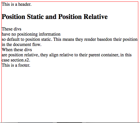
<header class="myheader">This is a header.</header>
<h2>Position Static and Position Relative</h2>
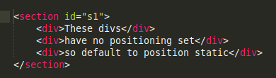
<section id="s1">
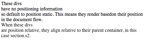
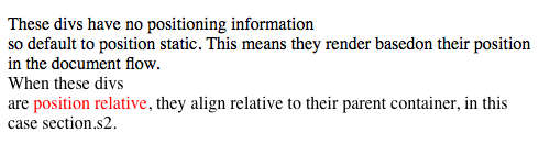
<div>These divs</divs>
<div>have no positioning information</div>
<div>so default to position static. This means they render based on their position in the document flow.</div>
</section>
<section id="s2">
<div class="pr">When these divs</div>
<div class="pr">are
<span class="red">position relative</span>, they align relative to their parent container, in this case section.s2.
</div>
</section>
<footer class="myfooter">This is a footer.</footer>
</body>
</html>2. Create a style sheet called style_positioning.css and save it to the same location as positioning_demo.html
body{height:1100px;border: 1px solid red;}View the results in a browser. They should look like the following. At this point, make your browser window smaller so that it has a vertical scrollbar.
3. Make the header fixed by adding the following class to your style sheet
.myheader{position:fixed;}Scroll up and down to see the results of your change.
4. Position the footer at the bottom of the screen by adding the following to the css:
.myfooter{position:fixed;bottom:10px;} 5. Now give the footer an absolute position:
.myfooter{position:absolute;bottom:10px;} Q10: The footer, when given an absolute position behaves differently when you scroll than when it has a fixed position. Describe this difference
6. Position static and relative
Add the following class to the style sheet:
.pr{position:relative;}This styling with be will be applied to the first and second divs of the section#s2:
<section id=”s2”>
	<div class="pr">These divs</div>
	<div class="pr">are
		<span class="red">position relative</span>, so are aligned relative to the parent container
	</div>
</section>
Refresh your screen. Nothing should happen. Making the above two divs position:relative renders the document no differently than before when they defaulted to position:static.
8. Now add the following to the .pr class
.pr{position:relative;left:100px}When you refresh notice how the two <divs> with the .pr class are now offset by 100 pixels.
Q11: What are the div.pr elements moving relative to when their left property is set?
8. Now change the .pr class style as follows:
Q12: Why did the two div.pr elements stop indenting?
9. Block, Inline and Inline-Block
Look at the rendered version of the document and then its source, focusing on the two sections. Notice how the document has line breaks where-ever there are <divs> but does not when there are <spans>. That is because <divs> are block elements and <spans> are inline elements. That means that divs have breaks before and after themselves; while spans can be placed within a line of text.
10. The display:inline-block styling merges these two elements. Add the following to your style sheet:
section div {display:inline-block}Q12: What happens when you refresh your page?
11. Setting height and line height to show the difference between inline-block and inline.
Spans are inline elements. Add the following styling so we can easily see the spans:
.red{color:red}When you refresh, you will see that span.red has become red. It is an inline element so it flows within the line.
12. Set the line-height of the spans
span {line-height: 68px;}13. Try to set the height property
Q13: Height is ignored. Why?
14. Make the spans block elements:
span {display:block;height: 68px;}When the span is made into a block element it gets a height property.
15. What is the difference between height and inline height?
Give your spans a border and then view them first with line-height set and then with height property set (not both at the same time)
span {display:block;line-height: 68px;border:1px solid purple;}

span {display:block;height: 68px;border:1px solid purple;}
Q14: How does the text position change based on height and line-height properties?
16. Bonus
Make the div.pr elements inline-block and play with both their line-height and height properties simultaneously to see what happens.
Exercise 4 – Margins and Padding
Purpose
To demonstrate the difference between margins and padding
Steps
1. Create a document called margins_and_padding.html and add the following code to it:
<!DOCTYPE html>
<html>
<head>
<meta charset="utf-8">
<title>Padding and Margins Example</title>
<link href="style_margins_and_padding.css" rel="stylesheet">
</head>
<body>
<section>
<h2>Padding and Margin Example</h2>
<div id="outer" class="border">Outer
<div id="middle" class="border">Middle
<div id="inner" class="border">Inner</div>
</div>
</div>
</section>
</body>
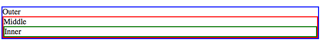
</html>2. In the same folder create a file called margins_and_padding.css and add the following styles:
#outer{border:2px solid blue;}
#middle{border:2px solid red;}
#inner{border:2px solid green;}
The results should look like the following:
3. Add the following style to the #inner element
#inner{border:2px solid green;margin:10px 10px 10px 10px}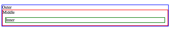
4. Add the following style to the #middle element
#middle{border:2px solid red;margin:10px 5px;}Q14: What happened?
5. Add the following style to the #outer element
#outer{border:2px solid blue;margin:10px;}Q15: What happened?
6. Change the styling associated the #inner element to the following:
#inner{border:2px solid green;margin:10px 20px 30px 40px;}Q16: What happened?
7. Change the styling associated the #inner element to the following:
#inner{border:2px solid green;margin:20px;padding:10px}Q17: What happened?
8. Change the style for #outer as follows:
#outer{border:2px solid blue;margin:-50px 10px 10px 10px;}Q18: What happened?
9. Make #outer position fixed, relative and absolute
Q19: What happened?
10. Make all three elements position:fixed.
#outer{position:fixed;border:2px solid blue;margin:10px;}
#middle{position:fixed;border:2px solid red;margin:10px;}
#inner{position:fixed;border:2px solid green;margin:10px;}
When you refresh you should see the following:
Q20: What happened?
Answers
Q1. The default color for the text is red, as set in the body tag. This is overridden by the more specific class .child-text., which is applied to the child paragraph and inherited by the grandchild paragraph.
Q2. The styling on the paragraph element is considered more specific than the class styling, so it takes precedence.
Q3. When the child-text class is directly attached to the child and grandchild elements, it becomes the most specific styling and therefore takes precedence.
Q4. The grandchild element became serif because styling assigned to an id (#grandchild) is more specific than class and element styling and therefore takes precedence.
Q5. Two two styles are equally specific, the last style to render will be the one which displays. This is determined by its position within the style sheet itself.
Q6. The paragraphs that are children and grandchildren of <section> become blue.
Q7. Only the immediate children of <section> become blue.
Q8. Paragraph One, Child Paragraph and Grandchild Paragraph are all first children.
Q9. The > operator selects the immediate children of the element or class in the style, in this case the section element.
Q10. Their position is set relative to their parent container.
Q10. The footer, when given an absolute position behaves differently when you scroll than when it has a fixed position. Describe this difference.
Q11. Their position is set relative to their parent container.
Q12. When the elements are styled as position:static then left can no longer be set. Use margins and padding instead.
Q13. The divs with the inline-block setting are displayed inline, instead of having breaks between each element.
Q14. Inline elements do not have a height property, use line-height and font-size instead.
Q15. The inline-block elements now have a height property.
Q16. Space added outside of element
Q17. Padding was added to all elements. 10px 10px format
Q18. Your answer: 10px added to top, right, bottom and left sides of element
Q19. The top of the element got 10 pixels of space added outside, the right of the element got 20px of space added outside the element, the bottom of the element got 30px of space added below it, and 40px of space was added to the left of the element.
Q20. 20px of space was added around the outside of the element (margin), 10px of space added within the element (padding).
Q21. The outer element moved up.
Q22. With position: fixed the width of the element shrunk based on text size, instead of defaulting to screen width. With position: relative the width expanded to the width of the screen. With position: absolute the with of the outer element shrunk based on text size.
Q23. All three elements are no longer in the document flow because they are position:fixed, as a result they are no longer nested. The point of this example is that properties like position and margin interact with each other.